[R] 산점도 및 여러가지 그래프
2022. 10. 9. 13:01ㆍDev.Program/Python & R
728x90
======== test4.R 180p
< 산점도 >
| # 산점도 : 데이터 x, y 축에 점으로 표현한 그래프 # 나이와 소득 연속값으로 두 변수의 관계 표현 df <- data.frame(age=c(25,35,45,55,65), sal=c(200,250,300,350,150)) # 패키지 불러오기 library(ggplot2) ggplot(data=df,aes(x=age, y=sal))+geom_point() |

| # x축범위조정 xlim() ylim() ggplot(data=df,aes(x=age,y=sal))+geom_point()+xlim(30,60) ggplot(data=df,aes(x=age,y=sal))+ geom_point()+ xlim(30,60)+ ylim(250,350) |

- Export 누르면 이미지파일/PDF파일로 저장가능!
< 막대그래프 >
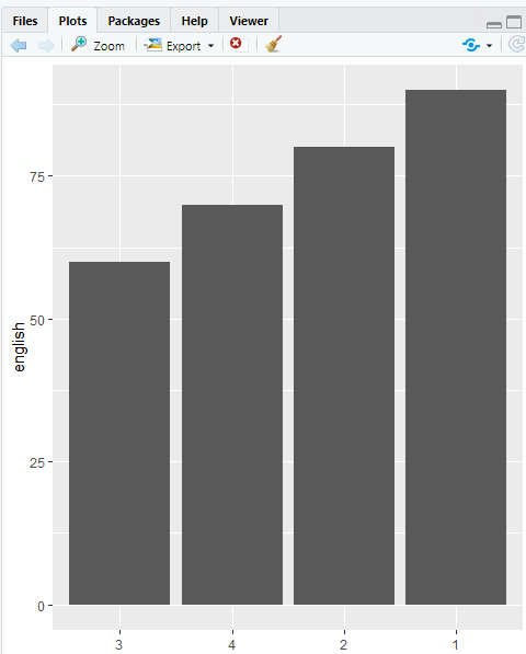
| # 막대그래프 df2<-data.frame(english=c(90,80,60,70), id=c(1,2,3,4)) ggplot(data=df2, aes(x=id,y=english))+geom_col() |

| ggplot(data=df2, aes(x=reorder(id,english),y=english))+geom_col() |
- 정렬 (낮은 것부터 오름차순)
| # 막대그래프 df2<-data.frame(english=c(90,80,80,70), id=c(1,2,3,4)) # 빈도막대그래프 ggplot(data=df2, aes(x=english))+geom_bar() |

< 선그래프 >
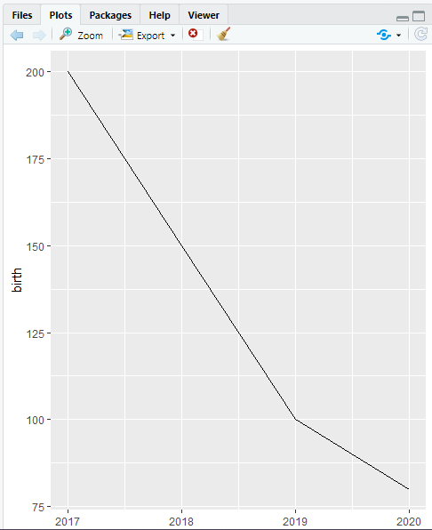
| # 선그래프 : 데이터를 선으로 표현한 그래프 df3<-data.frame(birth=c(200,150,100,80), year=c(2017,2018,2019,2020)) ggplot(data=df3,aes(x=year,y=birth))+geom_line() |
< 상자그림 >
| # 상자그림 : 데이터 분포를 직사각형 상자 모양으로 표현 df4<-data.frame(english=c(90,80,80,70), class=c(1,2,1,2)) ggplot(data=df4,aes(x=class,y=english))+geom_boxplot() |

======== test5.R p208

- 넣어주기
| # test5.R p208 # Koweps_hpc10_2015_beta1.sav 불러오기 # 통계치 파일 패키지 설치 install.packages("foreign") |

- 설치해주기!
| # 불러오기 library(foreign) library(dplyr) library(ggplot2) library(readxl) # 통계치 파일 가져오기 raw_welfare <- read.spss(file = "Koweps_hpc10_2015_beta1.sav",to.data.frame = T) welfare <- raw_welfare # 데이터 검토 View(welfare) |

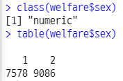
| # 데이터 검토 View(welfare) head(welfare) tail(welfare) dim(welfare) summary(welfare) # 열이름 바꾸기 welfare<-rename(welfare, sex=h10_g3, birth=h10_g4, marriage=h10_g10, religion=h10_g11, income=p1002_8aq1, code_job=h10_eco9, code_region=h10_reg7) View(welfare) # 성별에 따른 월급 차이 # 1단계 변수 검토 전처리 # 성별, 월급 # 변수간의 관계 분석 # 성별 월급 평균표 만들기 # 그래프 만들기 # 성별 변수 타입 class(welfare$sex) # [1] "numeric" table(welfare$sex) |
| # 성별 1남 2여 9모름 무응답 => NA => 빼고 계산, 평균치 계산 welfare$sex<-ifelse(welfare$sex==9,NA,welfare$sex) # 결측치 확인 table(is.na(welfare$sex)) |

| # 성별1 male, 2 female 로 바꾸기 welfare$sex<-ifelse(welfare$sex==1,'male',welfare$sex) welfare$sex<-ifelse(welfare$sex==2,'female',welfare$sex) table(welfare$sex) |
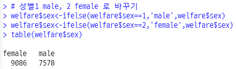
- welfare$sex<-ifelse(welfare$sex==2,'female',’male’) ⇐ 선생님 답!
| qplot(welfare$sex) |

| # 월급 변수 검토 전처리 class(welfare$income) # 변수 타입 [1] "numeric" summary(welfare$income) |

| qplot(welfare$income)+xlim(1,1000) |

| # 월급 모름 0 이나 9999 => NA welfare$income<-ifelse(welfare$income %in% c(0,9999),NA,welfare$income) table(is.na(welfare$income)) |

| # sex_income<- # filter na빼고 group_by(sex) summarise(mean_income=mean(income)) sex_income<-welfare %>% filter(!is.na(income)) %>% group_by(sex) %>% summarise(mean_income=mean(income)) sex_income |

| # 막대그래프 sex_income x=sex y mean_income ggplot(data=sex_income,aes(x=sex,y=mean_income))+geom_col() |

| # 나이와 월급 관계 # 나이 월급 변수 검토 전처리 # 변수 간 관계 분석 # 나이에 따른 월급 평균 표 만들기 => 그래프 # 나이 태어난 년도 class(welfare$birth) # 변수타입 "numeric" summary(welfare$birth) qplot(welfare$birth) |


| # 9999 모름 무응답 # 결측치 확인 table(is.na(welfare$birth)) # 이상치 => 결측치 변경 welfare$birth<-ifelse(welfare$birth==9999,NA,welfare$birth) |

| # 열추가 age 2015 - 태어난년도+1 welfare$age<-2015-welfare$birth+1 summary(welfare$age) qplot(welfare$age) |


| # 나이에 따른 월급 평균표 만들기 # age_income <- filter na 없이 group_by(age) # summarise(mean_income=mean(income)) age_income <-welfare %>% filter(!is.na(income)) %>% group_by(age) %>% summarise(mean_income = mean(income)) # 그래프 선그래프 x age y mean_income geom_line() ggplot(data=age_income,aes(x=age,y=mean_income))+geom_line() |

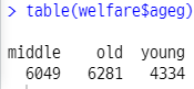
| # 연령대에 따른 월급 차이 # 연령대 월급 평균표 그래프 # 초년 30세미만 중년 30~59세 노년 60세이상 # ageg 열추가 welfare<-welfare %>% mutate(ageg=ifelse(age<30, "young", ifelse(age<=59, "middle", "old"))) table(welfare$ageg) qplot(welfare$ageg) |

| # ageg_income filter na 없이 group_by(ageg) summarise(mean(income)) ageg_income <- welfare %>% filter(!is.na(income)) %>% group_by(ageg) %>% summarise(mean_income=mean(income)) # 막대 그래프 data ageg_income x ageg y mean_income ggplot(data=ageg_income,aes(x=ageg,y=mean_income))+geom_col() |

⇒ 이렇게 요약하고, 그래프 그리는 거! 시험에 냅니다~
# p228
< 막대그래프 >
| # 연령대 및 성별 월급 차이 ageg_sex_income<-welfare %>% filter(!is.na(income)) %>% group_by(ageg,sex) %>% summarise(mean_income=mean(income)) ageg_sex_income |

| ggplot(data=ageg_sex_income,aes(x=ageg,y=mean_income,fill=sex))+geom_col() |

| ggplot(data=ageg_sex_income,aes(x=ageg,y=mean_income,fill=sex))+geom_col(position = "dodge") |

< 선그래프 >
| # 나이 및 성별 월급 차이 age_sex_income<-welfare %>% filter(!is.na(income)) %>% group_by(age,sex) %>% summarise(mean_income=mean(income)) age_sex_income ggplot(data=age_sex_income,aes(x=age,y=mean_income,col=sex))+geom_line() |

728x90
'Dev.Program > Python & R' 카테고리의 다른 글
| [Python] list.sort() 와 sorted(list) 의 차이 (0) | 2022.10.13 |
|---|---|
| [R] if문 / 이상치데이터 (0) | 2022.10.09 |
| [R] 데이터 가져오기 (0) | 2022.10.09 |
| 기상청 데이터 (0) | 2022.10.09 |
| 여러가지 그래프 (0) | 2022.10.09 |