여러가지 그래프
2022. 10. 9. 12:43ㆍDev.Program/Python & R
728x90
======== test3.py
train.csv → 타이타닉 승객 명단
| # test3.py # pandas 가져오기 # train.csv 파일 읽어들이기 import pandas as pd train_df = pd.read_csv('train.csv') print(train_df) |

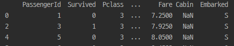
| print(train_df.head()) print(train_df.tail()) |

- 상위 5개

- 하위 5개
| print(train_df.mean()) |

- 평균
| print(train_df.describe()) |

| print(train_df['Survived']) print(train_df['Survived'][500:600]) print(train_df[100:120]) print(train_df[['Survived', 'Pclass', 'Age']]) |

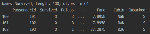
- 파일에서 100~120 까지

- 행과 열로 데이터 뽑아옴
| # 조건 조회 # Pclass 3등석 조회 # Age 60보다 큰 데이터 조회 # Age 60보다 큰 데이터 열 'Name' 'Age' 조회 print(train_df[train_df['Pclass']==3]) print(train_df[train_df['Age']>=60]) print(train_df[train_df['Age']>=60][['Name', 'Age']]) |


| # 열추가 # 'age_0' = 0 # 'age_10' = Age * 10 train_df['age_0'] = 0 print(train_df) train_df['age_10'] = train_df['Age'] * 10 print(train_df) # 열 삭제 # 'age_0' train_df_1 = train_df.drop('age_0', axis=1) print(train_df_1) |


| # 그룹 # 'Pclass' 그룹 전체 개수 # 'Pclass' 그룹 Survived 합계 # 'Pclass' 그룹 Age 최대값, 최소값 # 'Pclass' 그룹 Age 평균 Survived 합계 # 'Sex' 그룹 Age 평균 Survived 합계 print(train_df.groupby(by='Pclass').count()) print(train_df.groupby(by='Pclass')['Survived'].sum()) print(train_df.groupby(by='Pclass')['Age'].agg([max,min])) agg_format = {'Age':'mean', 'Survived':'sum'} print(train_df.groupby(by='Pclass').agg(agg_format)) print(train_df.groupby(by='Sex').agg(agg_format)) |


< 그래프 >
프로그램 설치
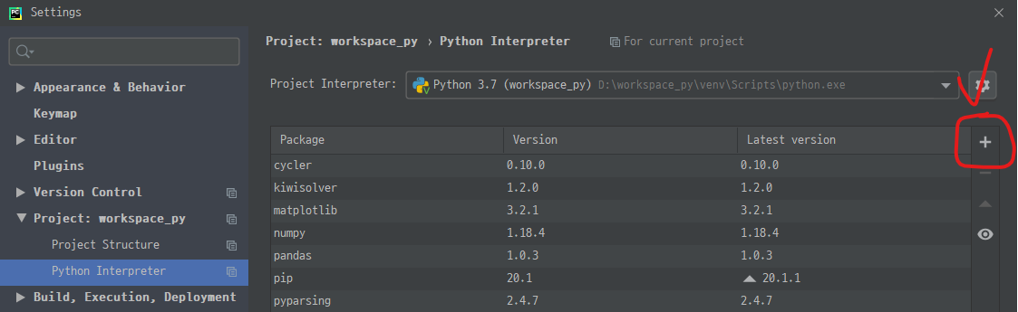
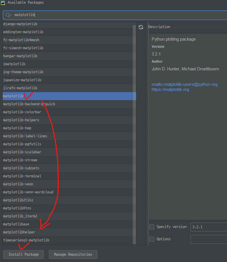
- matplotlib 설치
- 설치완료
======== test4.py
어떤 그래프를 선택하는지가 중요함!
| # test4.py # 데이터 시각화 # matplotlib 패키지(가장 기본) 설치 # 선 그래프, 산점도, 막대그래프, 히스토그램(분포도), 파이그래프(원그래프) |
< 선 그래프 >
- 순서가 있는 숫자(뱐하는 숫자) 데이터를 시각화
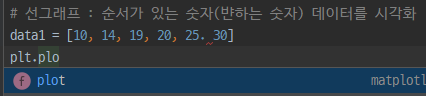
- 선그래프
| # 선그래프 : 순서가 있는 숫자(뱐하는 숫자) 데이터를 시각화 data1 = [10, 14, 19, 20, 25, 30] plt.plot(data1) plt.show(data1) |

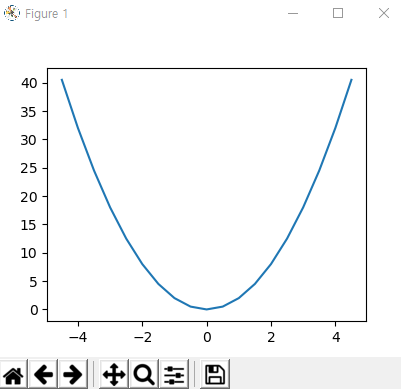
| x = np.arange(-4.5, 5, 0.5) # -4.5에서 5까지 0.5 만큼 print(x) y = 2 * x ** 2 print(y) |

- x, y 값 준비!
| plt.plot(x, y) plt.show() |
| y2 = 5 * x + 30 print(y2) plt.plot(x, y2) plt.show() |


| # 창지정 그래프 plt.figure(1) plt.plot(x, y) plt.figure(2) plt.plot(x, y2) plt.show() |

- 두 창이 한번에 뜸!
| # 창지정 그래프 plt.figure(1) plt.plot(x, y) plt.figure(2) plt.plot(x, y2) plt.figure(2) plt.plot(x, y3) plt.show() |

- 한 figure 에 넣으면 이렇게 같이 뜸
| plt.figure(1) plt.plot(x, y) plt.figure(2) plt.plot(x, y2) plt.figure(2) plt.clf() # 기존 그래프 삭제 plt.plot(x, y3) plt.show() |

- 겹치던 그래프가 없어짐
| plt.subplot(2, 2, 1) # 2행 2열의 첫번째 plt.plot(x, y) plt.subplot(2, 2, 2) # 2행 2열의 두번째 plt.plot(x, y2) plt.subplot(2, 2, 3) # 2행 2열의 세번째 plt.plot(x, y3) plt.show() |

- 한 화면에 다 나옴!
| plt.plot(x, y) plt.plot(x, y2) plt.show() |

→ 이렇게 한 그래프를 본다고 했을 때 겹쳐지는 부분(-4 ~ -2)을 더 확대해서 보고싶다!
> x축 범위, y축 범위 지정해주기
| # x축 범위 y축 범위 plt.plot(x, y) plt.plot(x, y2) plt.xlim(-4, -2) plt.ylim(10, 20) plt.show() |

| # 그래프 꾸미기 # b파랑 g녹색 r빨강 c청록 m자홍 y노랑 k검정 w하양 # -실선 --파선 :점선 -.파선점선 혼합 # o원모양 ^위쪽 v아래쪽 <왼쪽 >오른쪽 # s사각형 p오각형 h,H육각형 *별모양 +더하기 x,X엑스모양 D,d다이아몬드모양 x = np.arange(0, 5, 1) y1 = x y2 = x + 1 y3 = x + 2 y4 = x + 3 plt.plot(x, y1, 'r', x, y2, 'b', x, y3, 'y', x, y4, 'g') plt.show() |

| plt.plot(x, y1, '-', x, y2, '--', x, y3, ':', x, y4, '-.') plt.show() |

| plt.plot(x, y1, '>-r', x, y2, 's-g', x, y3, 'd:b', x, y4, 'X-c') plt.show() |

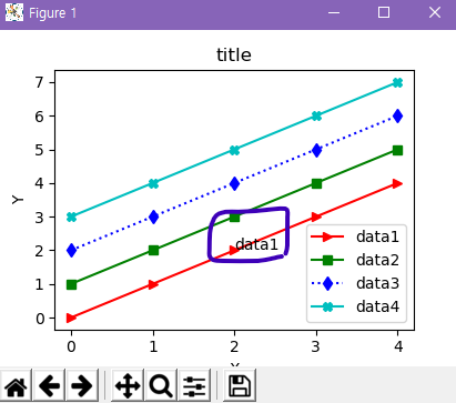
| plt.plot(x, y1, '>-r', x, y2, 's-g', x, y3, 'd:b', x, y4, 'X-c') plt.xlabel('X') plt.ylabel('Y') plt.title("title") plt.legend(['data1', 'data2', 'data3', 'data4']) plt.show() |

- title, X축 Y축 제목, 범례(legend)
| plt.legend(['data1', 'data2', 'data3', 'data4'], loc='lower right') |

- 범례 위치 변경 가능!
| plt.text(2, 2, 'data1') |
- 데이터 내부에 글자입력 가능
| plt.text(2, 2, '데이터1') |

- 그냥 한글을 넣을 시 한글 깨짐
| # 그래프 한글처리 import matplotlib matplotlib.rcParams['font.family']='Malgun Gothic' matplotlib.rcParams['axes.unicode_minus']=False |

< 산점도 >
- 두 요소 데이터 집합관계
| # 산점도 : 두 요소 데이터 집합관계 height = [165, 177, 160, 180, 185] weight = [62, 67, 55, 74, 90] plt.scatter(height, weight) plt.show() |

| plt.scatter(height, weight, s=500, c=['r', 'g', 'b', 'c', 'm']) |
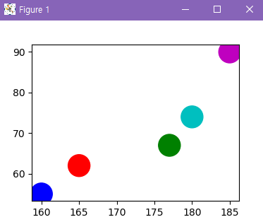
- s = size(점 크기) c = color(색) ← 색은 꼭 리스트형태가 아니라 하나만 줘도 됨!
< 히스토그램 >
- 정해진 간격으로 나눈 후 그 간격안에 들어간 데이터 개수를 막대로 표시한 그래프
- = 데이터가 분포 되어있는지 확인할 때 사용
| math = [76,82,84,83,90,65,54,66,86,85,92,72,71,100,87,81,76,97,78,81,45,68,78,45,38,77,79] plt.hist(math) plt.show() |

| plt.hist(math, bins=8) # 구간을 8개로 나눠서 plt.show() |

| math = [76,82,84,83,90,65,54,66,86,85,92,72,71,100,87,81,76,97,78,81,45,68,78,45,38,77,79] plt.hist(math, bins=8) # 구간을 8개로 나눠서 plt.xlabel('시험점수') plt.show() |

< 파이그래프(원) >
- 원그래프 원안에서 각항목별로 비율만큼 부채꼴 크기 갖는 영역
| result = [7,6,3,2,2] plt.pie(result) plt.show() |
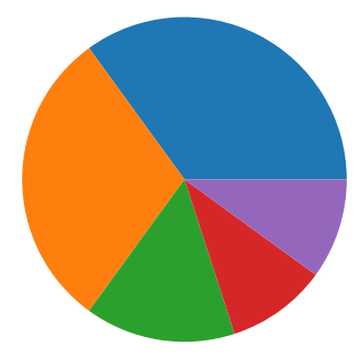
| fruit = ['사과', '바나나', '딸기', '오렌지', '포도'] plt.pie(result, labels=fruit) plt.show() |

| plt.savefig('testimg1.png', dpi=100) plt.savefig('testimg1.pdf', dpi=100) |

- 이미지/pdf 파일로 저장됨
< 막대그래프 >
- 값을 막대의 높이, 여러항목의 수량이 많고 적음, 항목데이터 비교
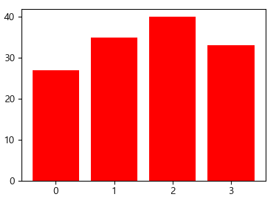
| # 회원 윗몸일으키기 운동전 횟수, 운동후 횟수 mem_id = ['m1', 'm2', 'm3', 'm4'] before_ex = [27, 35, 40, 33] # 운동 전 횟수 after_ex = [30, 38, 42, 37] # 운동 후 횟수 # 회원수 mem_num = len(mem_id) # x 축 index = np.arange(mem_num) # 0 1 2 3 # 막대그래프 plt.bar(index, before_ex) plt.show() |

| plt.bar(index, before_ex, color='red') plt.show() |
- 여러색 지정도 가능!
| plt.bar(index, before_ex, color='red', tick_label=mem_id) plt.show() |

- 라벨 지정!
- 바로 mem_id 를 넣어주지 않고(그래도 결과는 똑같이 보임) x 축엔 index 를 넣고 label 로 mem_id 를 설정하는 이유가 있다!(이후에 나옴)
| plt.bar(index, before_ex, color='green', tick_label=mem_id, width=0.4) plt.bar(index, after_ex, color='yellow', tick_label=mem_id, width=0.4) plt.show() |
- 두 개를 넣으면

- 이렇게 겹쳐서 하나만 나옴!
| plt.bar(index, before_ex, color='green', tick_label=mem_id, width=0.4) plt.bar(index + 0.4, after_ex, color='yellow', tick_label=mem_id, width=0.4) plt.show() |
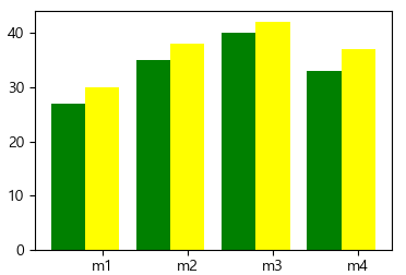
- 이렇게 옆으로 이동시킬 수 있다! 그래서 x 축에 mem_id 를 바로 넣지 않고 index 값을 지정해서 x 축에 index 값을 넣어줌!
| plt.xticks(index+0.2, mem_id) |

- 위치 옮겨줌
| plt.bar(index, before_ex, color='green', tick_label=mem_id, width=0.4, label='before') plt.bar(index + 0.4, after_ex, color='yellow', tick_label=mem_id, width=0.4, label='after') plt.xticks(index+0.2, mem_id) plt.legend() plt.xlabel('회원ID') plt.ylabel('윗몸일으키기 횟수') plt.title('운동 시작 전 후 비교') |
- 라벨 붙이기

| # 가로 막대그래프 plt.barh(index, before_ex, color='green', tick_label=mem_id) |

728x90
'Dev.Program > Python & R' 카테고리의 다른 글
| [R] 데이터 가져오기 (0) | 2022.10.09 |
|---|---|
| 기상청 데이터 (0) | 2022.10.09 |
| 여러가지 메서드 (0) | 2022.10.09 |
| 1차원 테이블 / 2차원 테이블 (0) | 2022.10.09 |
| 함수 Import 방법 / 외장함수 (0) | 2022.10.09 |